Project Brief
The confirmation page was lack of order information; it didn’t add value to users. Additionally, it didn’t support different inventory needs. In this project, I was working with a PM and an engineering team to build a new templet for the confirmation page.
Skills
- User Experience Design
- Visual Design
Problems From the Existing Page
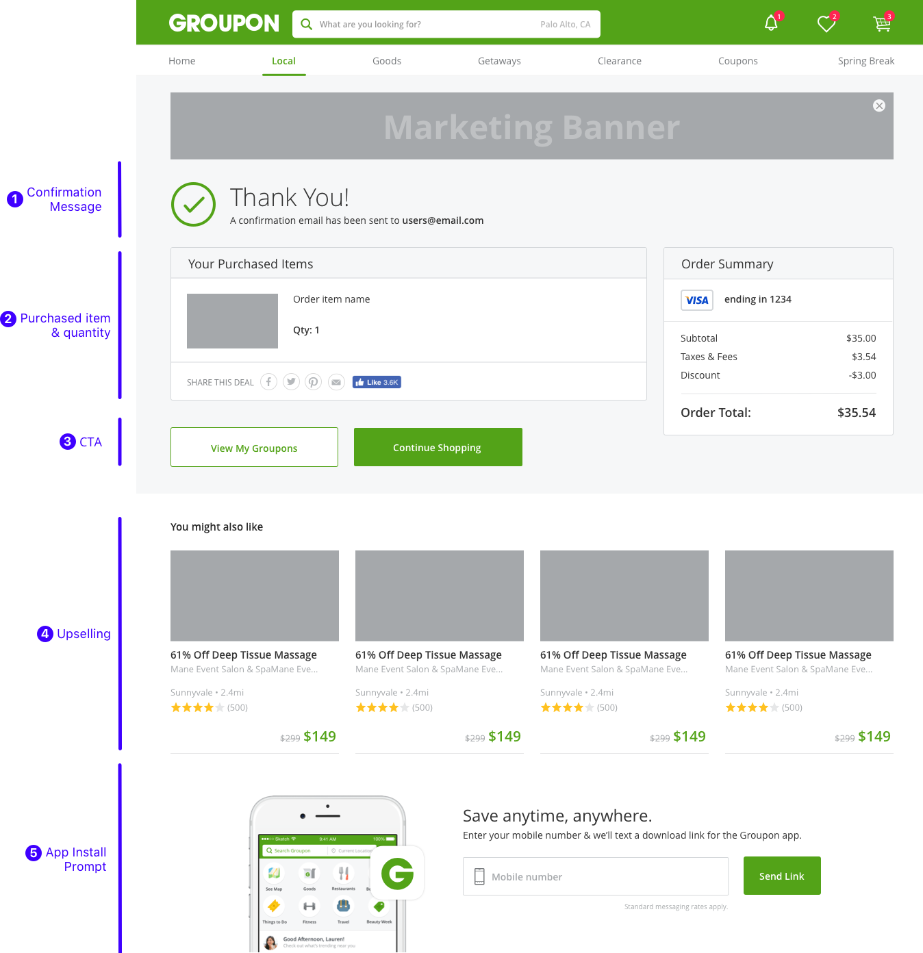
- Clarity: The order information is not comprehensive. The quantity and order subtotal is missing, so the user can’t confirm their order right away.
- Hierarchy: The up-selling widget is the most prominent element on the current which neglects users' primary goal on this page, which is confirming the purchase.
- Scalability: The current design can’t support all inventory's needs.
- Unclear CTA: Most of the user tends to go to the My Groupon to check the order, but it’s hard to do so since the CTA is hidden as a link in a sentence.
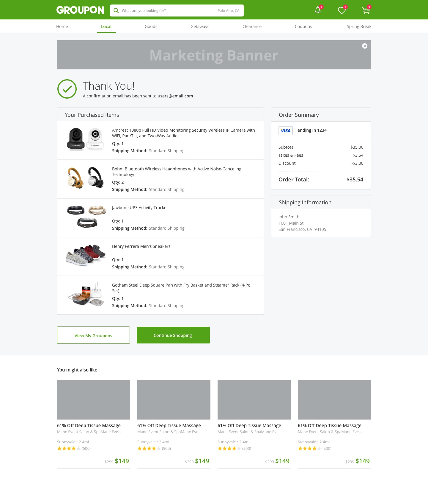
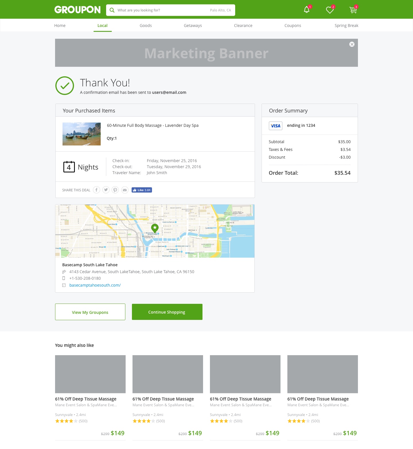
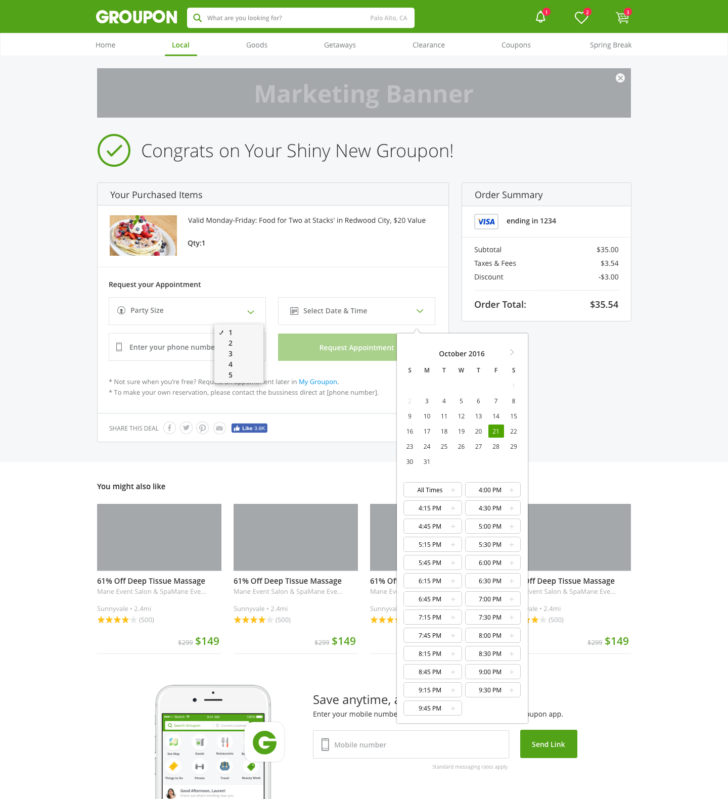
Create a Templet
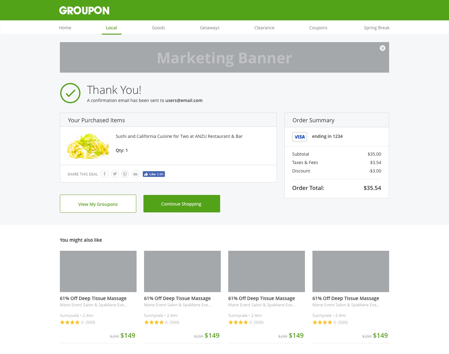
Apply to Local Order
Apply to Goods Order
Apply to Geteways Order
Apply to Booking Order
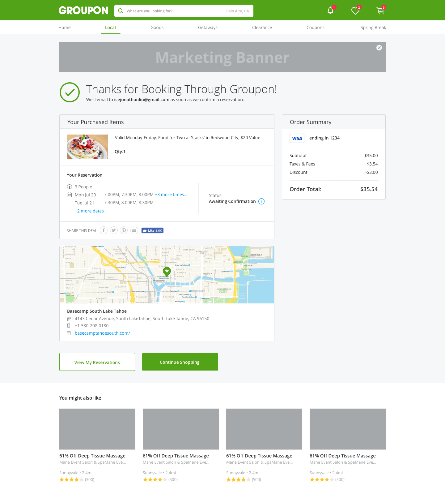
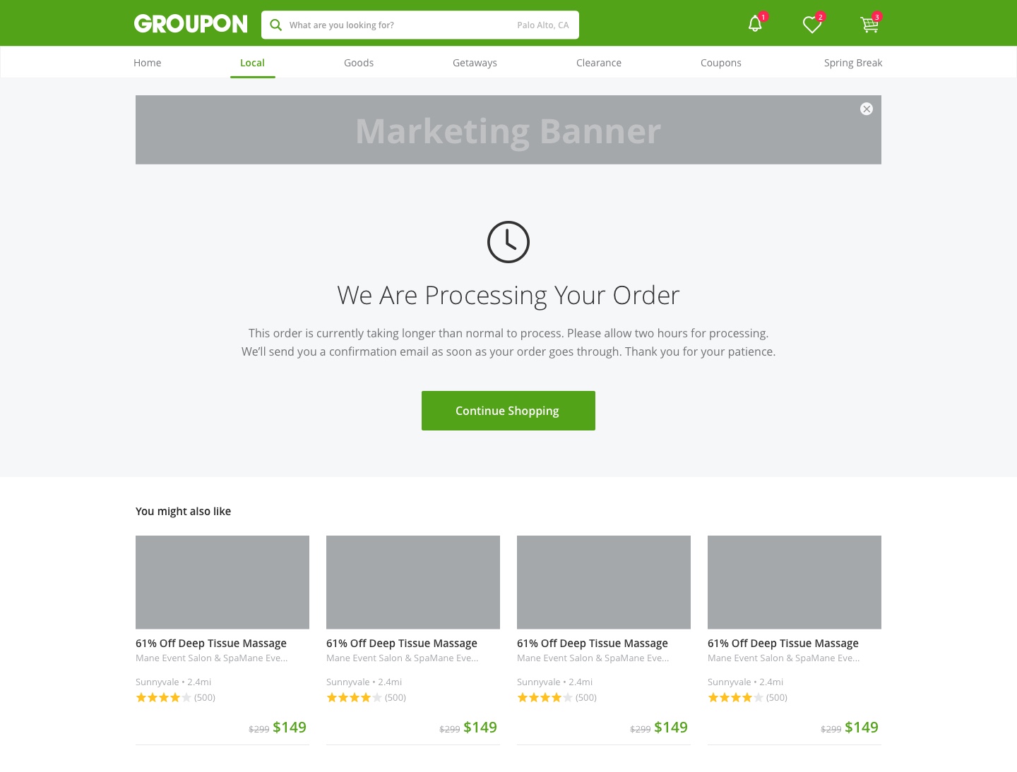
Apply to Processing State