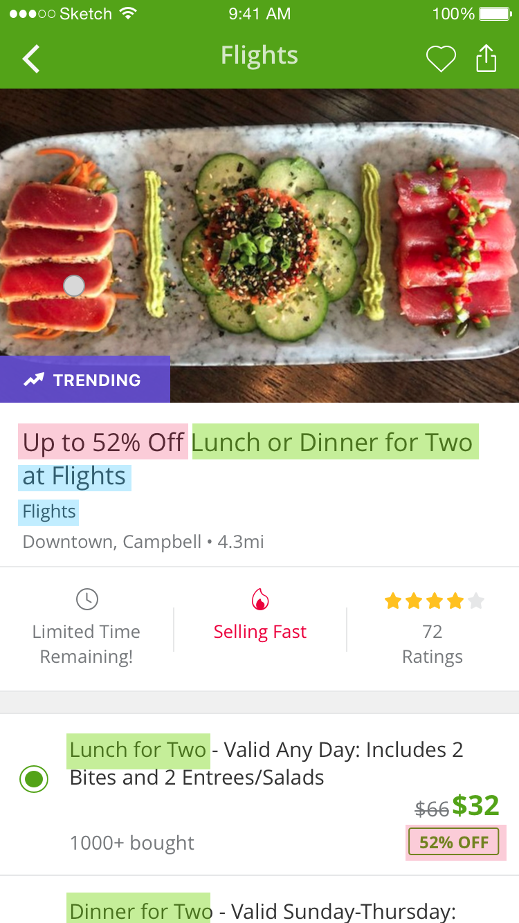
Many Groupon users were struggling with finding a way to quickly evaluate deals. That’s because the high impact information like merchant name and location is hard to find. Above that, the complex option title can cause purchase mistakes easily. In this project, I was focused on addressing these two big pain points.
- 1 Designer (Me)
- 1 UX Resercher
- 2 PMs
- Cross Platform Engineers
- UX
- Visual Design
- User Research
- Prototyping
User Journey
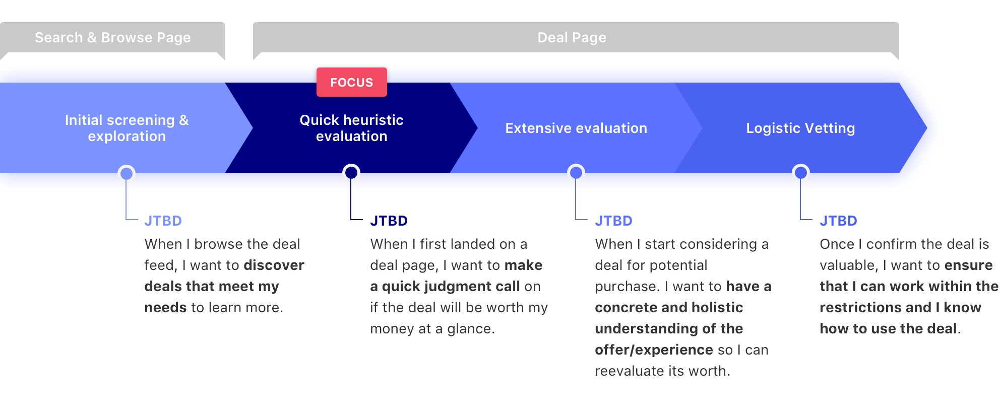
Two biggest problems in quick heuristic evaluation stage
- Critical merchant infomation is hard to access. For example, merchant name and location are either too small to see or hidden at the bottom of the page.
- Option title is too lengthy. When there are multiple deal options, the option titles are hard to compare the differences.
What’s the success will look like
- Users are able to quickly decide if this is the deal for them and have the information they need at their fingertips.
- User can easily compare different options and find the best option for them.
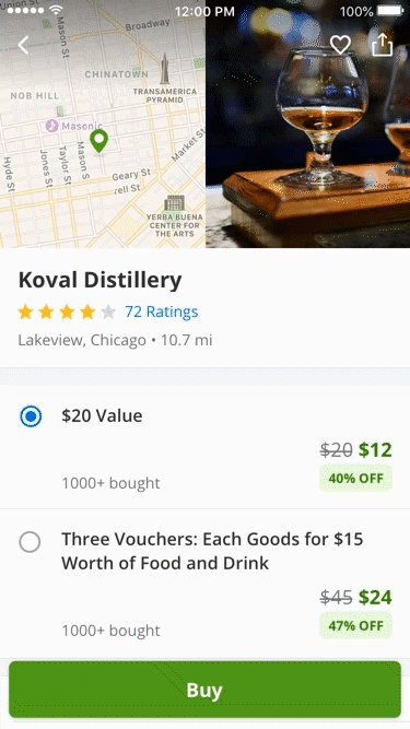
Improve the key merchant information to make it easy to access
When evaluating a deal, users are not only looking for the discount but also key merchant infomation to make the purchase decision. The current deal-centric structure are missing this opportunity.
Problems
- Merchant name is hard to find at a glance, even though we show it at three different places.
- Too many repeated contents. The deal title and option title are the same, it increases the user's cognitive load.
- Location is hard to access. Users have to scroll to the bottom of the page to find the map.
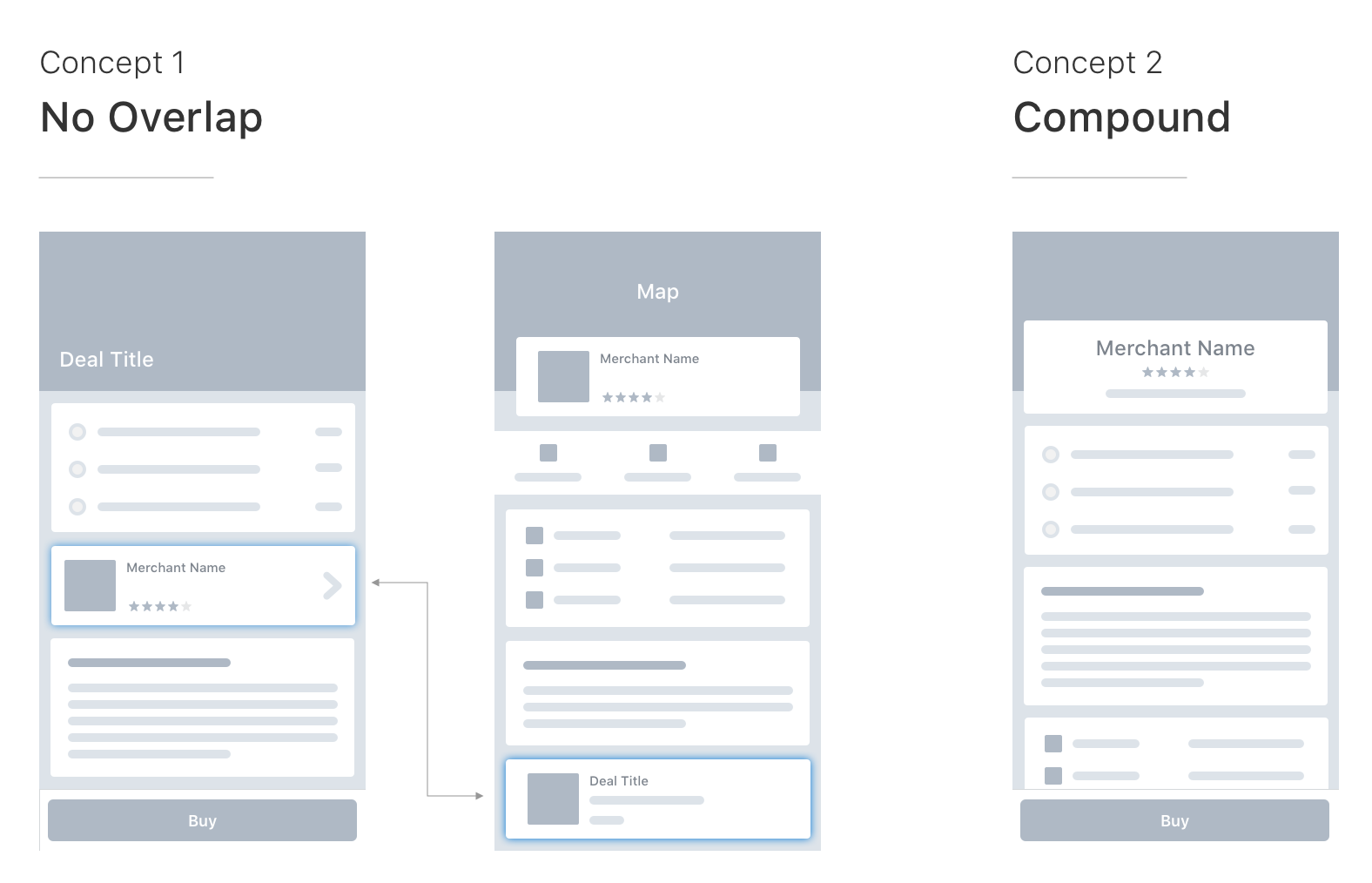
Concept Testing
After narrowing down the problem to two focuses: merchant info and location, I started to explore different page structures. There are two strongest concepts that stand out after a couple rounds of discussion with the team. At this point, I wanted to know which concept would work, so I had a usability test to figure it out.
Takeways
- Merchant name helps users to understand the deal faster
- Having location / map at the bottom isn’t ideal
- Groupon users and non-Groupon users have different behavior
Exploration: UI & Interactions
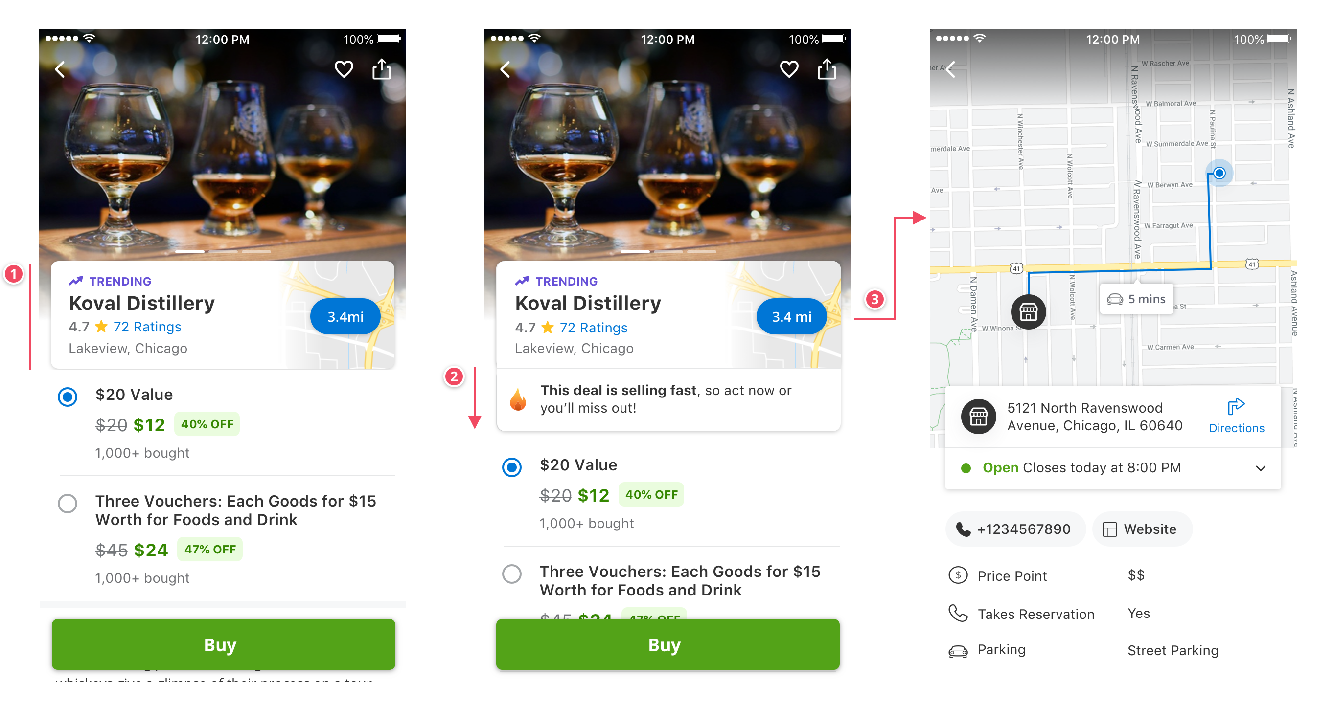
After the usability testing, I received a strong signal that merchant-centric page title helps users understand the deal quicker, which is the concept 2 approach. However, the location issue still hadn’t been addressed in concept 2. So this round of UI exporation, I was focused on what’s the right UI treatment for introducing the entry point of the location.
The following were three versions: tabs, image carousel. (left to right)
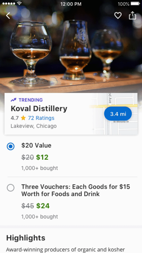
I first ran an a/b testing on the Tabs version, and then noticed that not many people were interacting with the tabs. So I came up with an aggressive version which inserted the location map in the image carousel. However, I didn’t go with this version because I thought it may hurt the conversion considering image quality is highly correlated to the conversion based on a past testing. At the end, I landed on the card version because it has better grouping and visibility.
Interaction Breakdown
Before
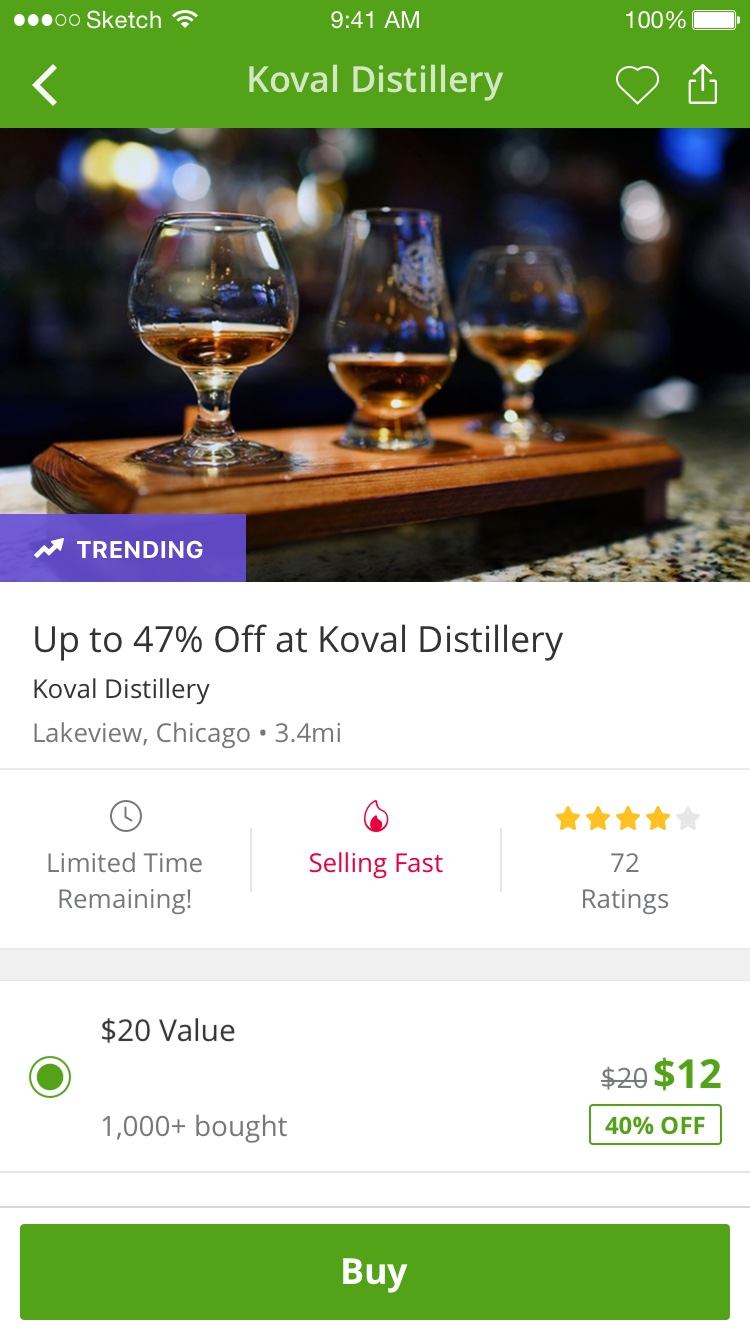
MVP (launched)
Northstar
Result of MVP
- Merchant-centric Page Header: Icrease of +$2.2M Net Operational Revenue
- Conversational Urgency Message: Icrease of $3.52M Net Operational Revenue
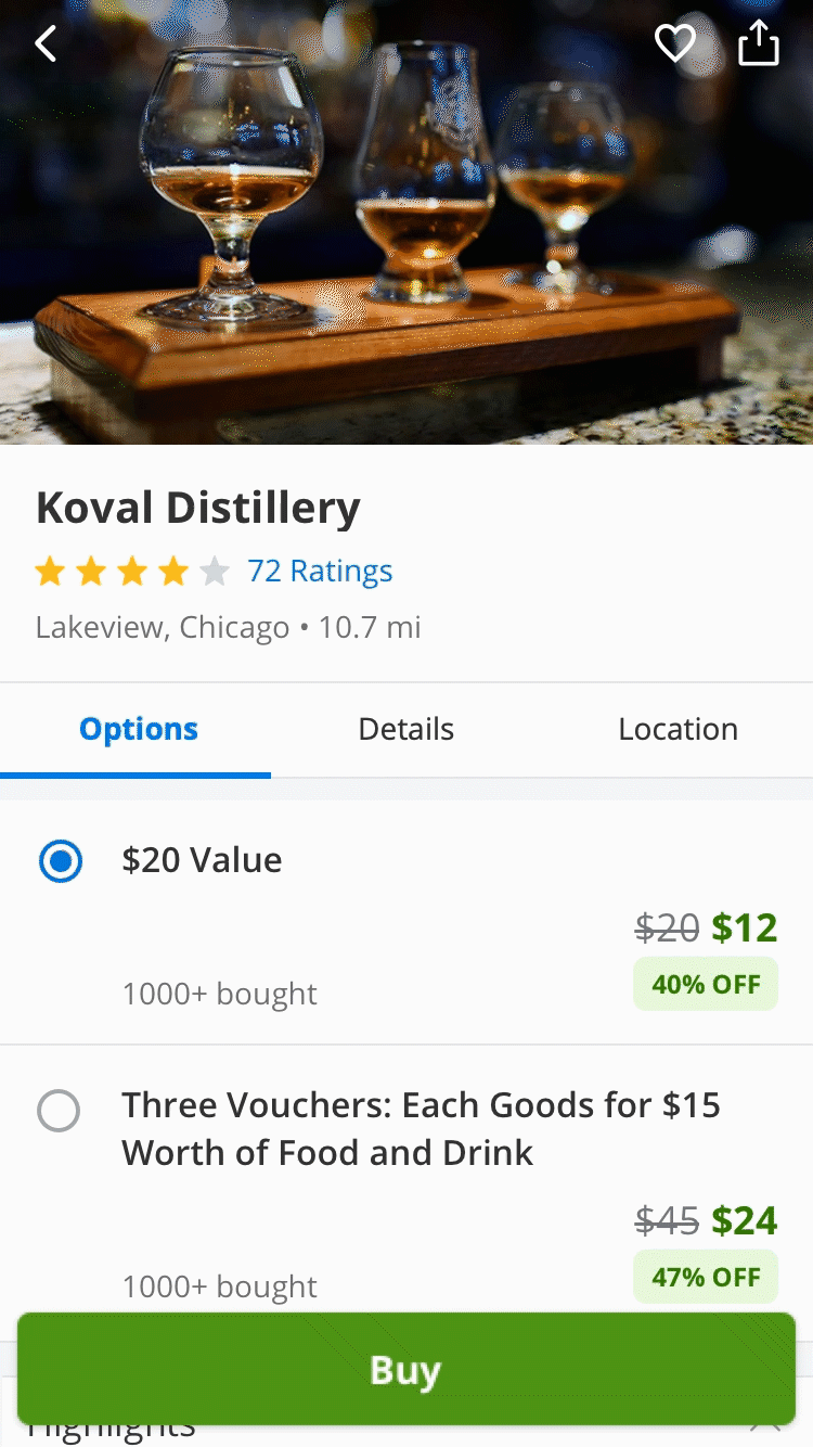
Improving the scalability of the option
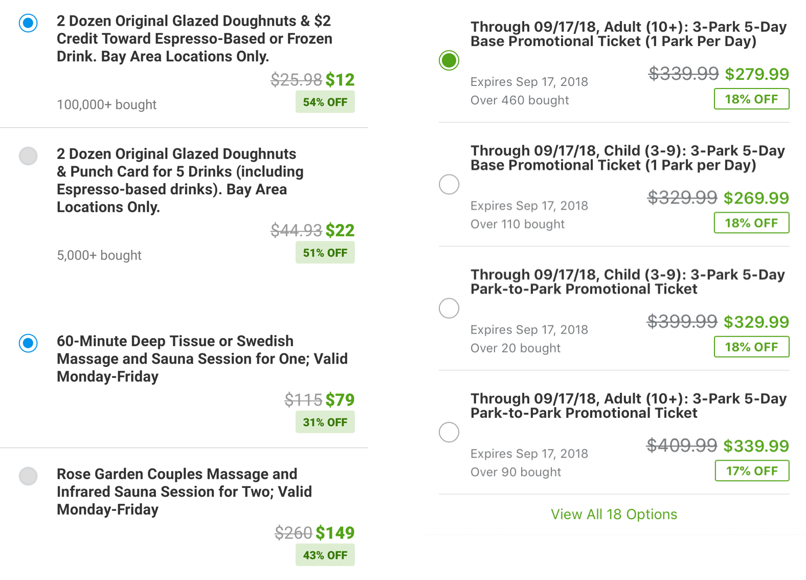
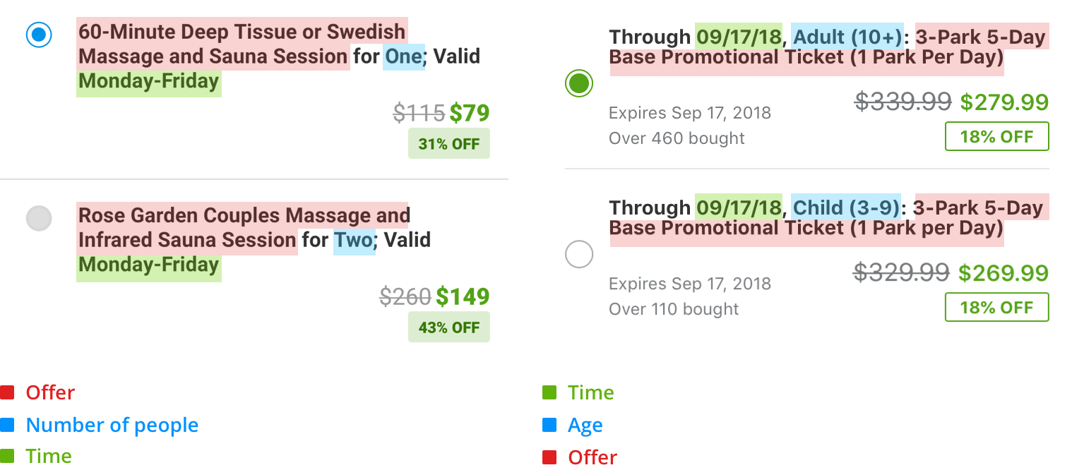
Complex option title will take users longer time to comprehend, especially when the option title contains too many details, such as time, location, what’s included...etc.
Problems
- Numerous options
Users need to spend longer time to read the option title and it’s difficult to compare between options.
- Lengthy option titles
Lengthy and trivial option titles can easily cause purchase mistakes because there are only a few words difference between options.
Design Direction
To make the option easy to digest and avoid wrong purchases, the idea is to break down option title to attributes, so users only need to make one decision at a time. Additionally, the action of selection can force users to pay more attention to the details, such as the redemption time. That can reduce the chance of making the wrong purchase.
Design Explorations
#1: Exposed Options
Implementation difficulty: ★☆☆☆☆
Pros:- Can directly see options
- Highlight the price change in the half sheet
- Low developing cost
Cons:
- Pill UI can’t scale well for the long title
- Hard to compare price between options
#2: Listview
Implementation difficulty: ★★☆☆☆
Pros:- Able to fit long option title
- Can compare price between options
- Prevent triggering errors
Cons:
- The option is hidden on the deal page
#3: Hierarchy Model
Implementation difficulty: ★★★★★
Pros:Cons:
- High build cost since it will require back-end tool change and editorial team’s training
- Remove the Buy button from the deal page could potentially have a negative impact on the conversation
Validation
Considering the technical restriction, we picked #1 and #2 to run an A/B testing on mobile web and Android Local deal page.
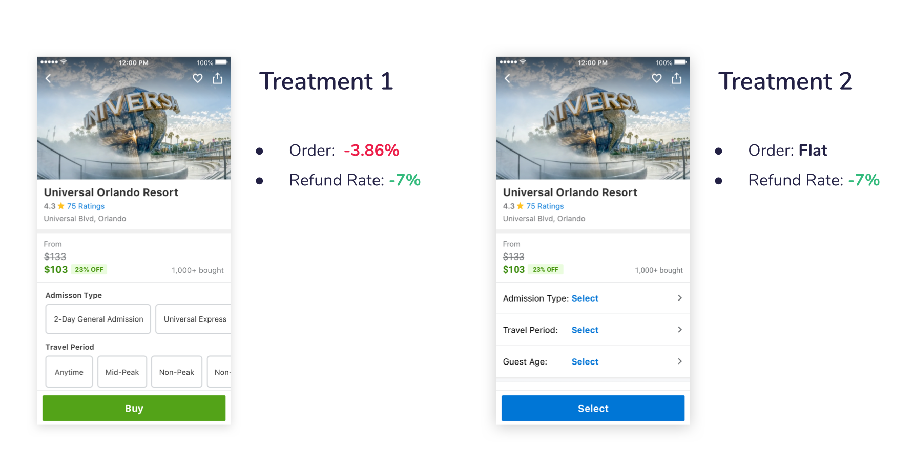
- #2 performs better than #1
- The new design helps users to avoid purchase mistakes. The refund rate reduce 0.18% in 30 days
- Traits don’t work on all type of deals.
Traits don’t work on all deals, but for some complex deals with a massive number of options, such as ticket deals, it does help the user to find the option faster. Therefore, as the next step, we should work closely with customer support and data scientists to define what are the right deal types to apply traits.