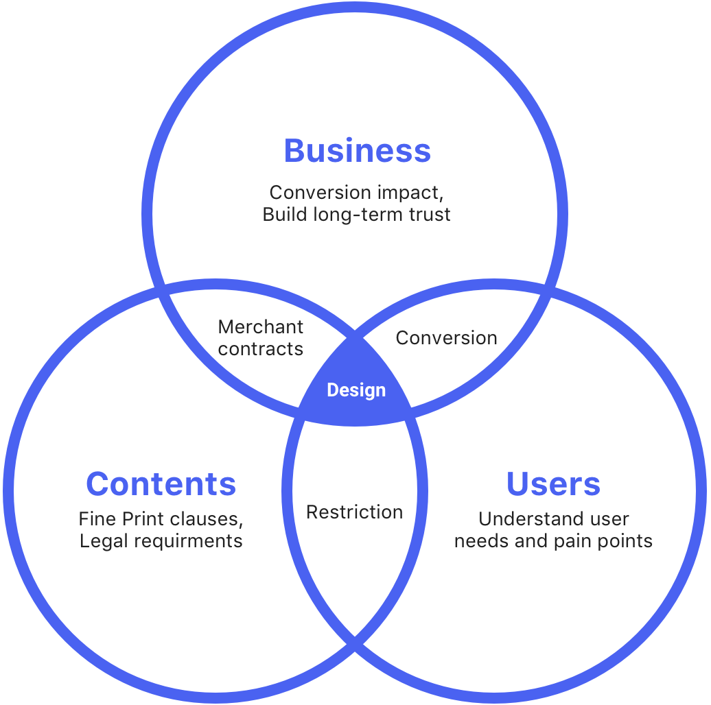
Content structure is the key of this project. From the user perspective, Fine Print should be as clear as possible to avoid future redemption problems. On the other hand, when Fine Print is "too clear", users feel the deal is restrictive, that hurts the conversation. Therefore, I was focused on finding the right balance between user and business needs by restructured the Fine Print content.
- UX Design
- Prototyping
- Content strategy
- User research
My Role
I teamed up with a PM, a UX researcher, and a content strategist. At the early stage, I worked with the UX researcher to conduct a series of user studies to understand the problem from different perspectives (users, sales reps, merchants). Meanwhile, I worked with the content strategist and PM to analyze Fine Print data. Thereafter, I proposed two design recommendations and went through a user testing to determine the final design.
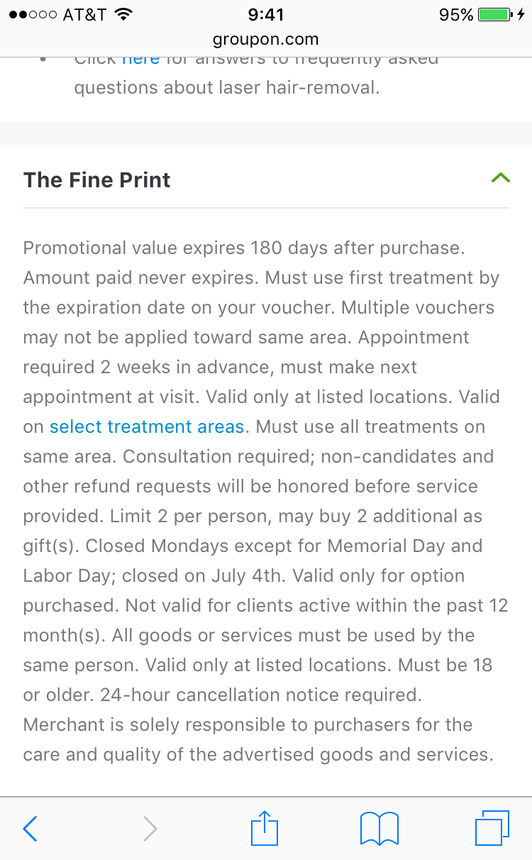
“The fine print get’s you. I bought this Groupon for a yoga class, but it turns out with the restrictions I can’t use it. That’s very frustrating.”
The Problem
Like Maria’s story, there are so many unsatisfied Groupon experiences related to Fine Print. In fact, unclear Fine Print is one of the biggest reasons users contact customer support. Users ask for a refund because they overlooked important information in the Fine Print. If the refund can not be issued, they more likely won’t come back to Groupon again. Also, they could leave a bad review on the app store. Therefore, this problem could hurt not only the business but the trust of the brand for the long run.
Users Problems
- Negative redemption experience due to miss important information/restrictions
- High-effort to comprehend and digest fine print contents
Business Problems
- Negative post-purchase experience results in lost of trust in Groupon
- Negative redemption experience impacts long term conversion and engagement
- Increased operational cost in customer support
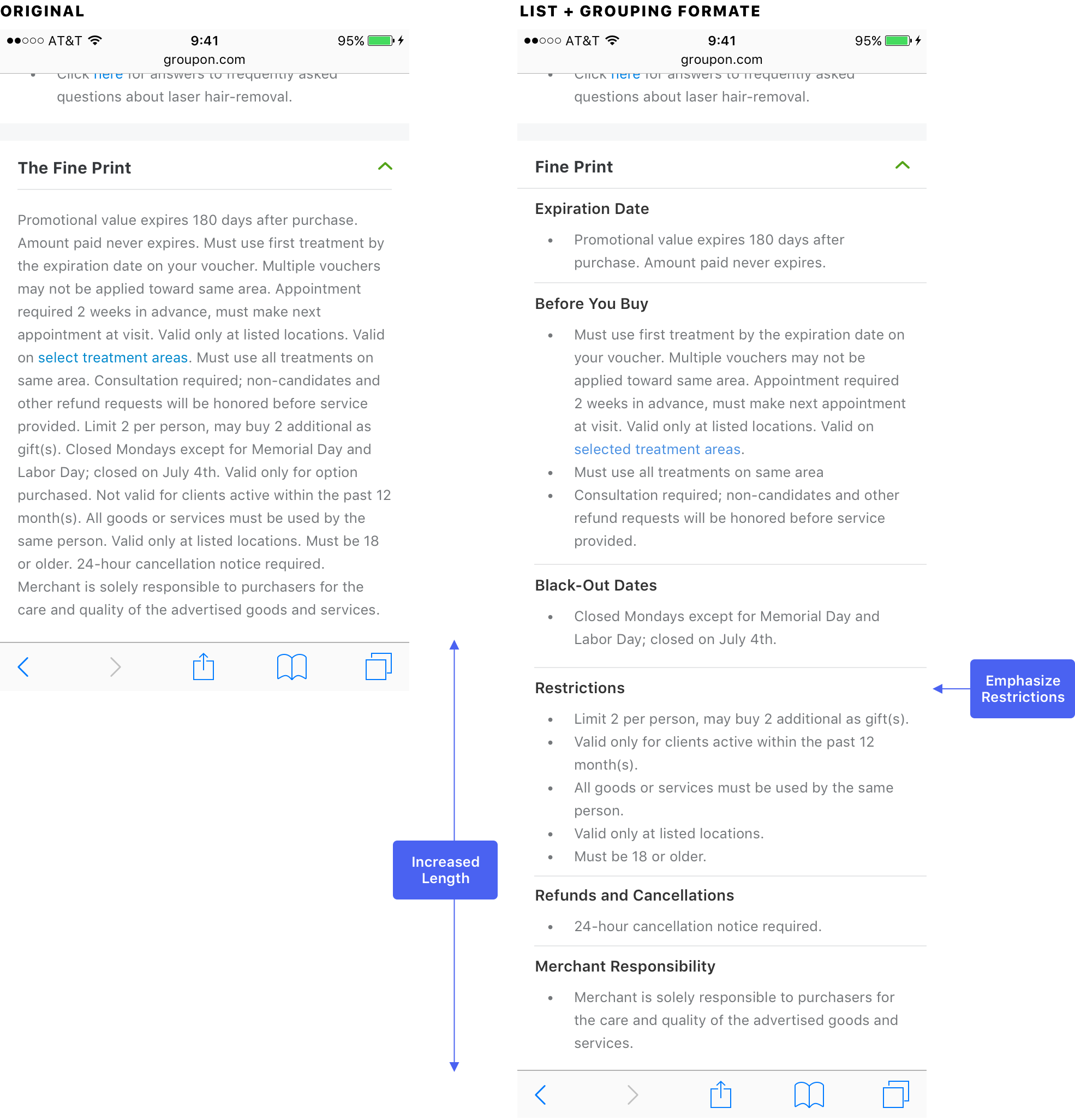
First Try: Structured Fine Print (My Starting Point)
Before I joined the project, here was where we were. Since the goal was to make Fine Print easy to read and digest, the first attempt was to display Fine Print in a list format instead of a block of text. In order to gain this ability, the team started to transform Fine Print clauses to modules from the back-end. After the back-end was ready, the team ran an experiment of this new format of Fine Print.
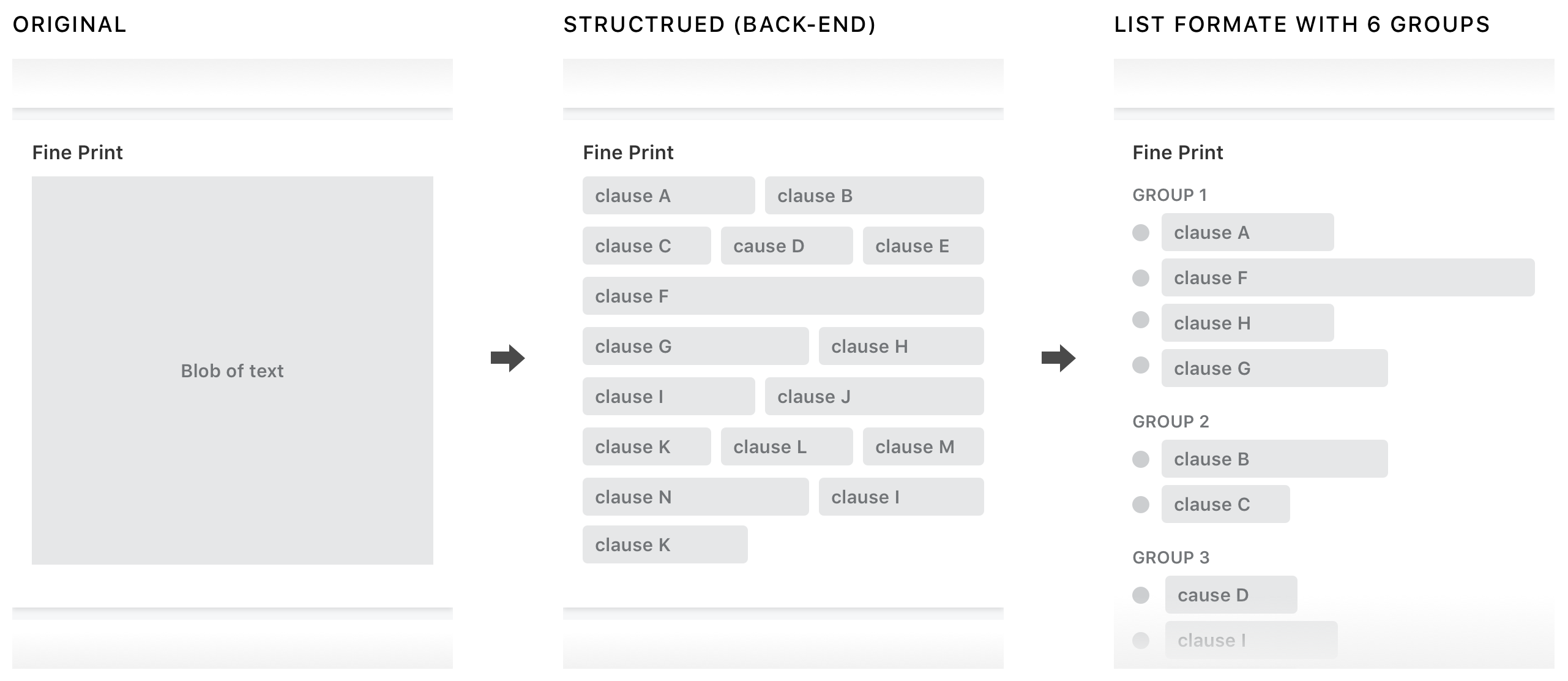
Unfortunately, the experiment failed. The list format did slightly reduce refund rates, but also dropped the conversation badly. The Orders/UV decreased between -1.2%~-1.6% across all platforms, so the experiment was terminated after 2 weeks. However, unclear Fine Print was still one of the biggest user pain points, and we want to address it. Here was where I started from.
What I Got From the Past Failure
Hypothesis
- The deal looks more restrictive with listed Fine Print clauses because the Fine Print section becomes longer
- Users spend more effort to read every single clauses because all of them are given equal amount of emphasis
- Group name like “Restriction” emphasizes the limitation of the deal
- On the other hand, irrelevant clauses may be over emphasized because it’s under a serious group like “Restriction”.
- User reads Fine Print more carefully and decide not to buy
Open Questions
- How can we reduce the length of Fine Print without removing any contents?
- Does all Fine Print give users the same impact? If not, what are those high impact fine print clauses?
- Does current grouping match user's mental model?
To answer those questions, I wanted to take a step back to understand what the Fine Print and each clause means to the user. Does current groups and information hierarchy make sense to users? If we don’t tell the users those are Fine Print clauses, from pure content perspective, how those pieces of information impact their purchase decision? To find the opportunity, I think we should look at the problem from a different angle, and that’s why we decided to conduct a user study to find the answer.
User Study: Are All Fine Print Clauses Fine Print?
Goal
To understand user’s mental model on individual Fine Print clauses. Observing how will users sort pieces of Fine Print contents when they don’t know where is the content originally from.
Participants & Task
We recruited 2 power users, 5 engaged users, 4 new or inactive users, and ask them to sort fine print clauses cards and give each group a name.
Takeway 1: Not all clauses in Fine Print section are fine print
In the card sorting exercise, users actually didn’t put many clauses into the Fine Print bucket. That means putting content that’s not be considered as fine print in Fine Print section can cause users to miss important information. After watching 11 people did the card sorting exercise, we found this pattern across most of participants’ mental model.
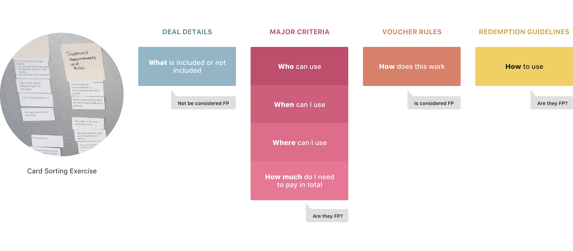
Takeway 2: Giving all clauses equal weight makes deal overall seems more restrictive
Another key finding was that not all Fine Print clauses was important to users. Users described some clauses were “deal breakers” and some of them were just “background noise”, and the rest of them were in between. Which showed giving all clauses equal weight made deal overall more restrictive and increased the time to digest them.
Decision: Break Fine Print Into Two Parts
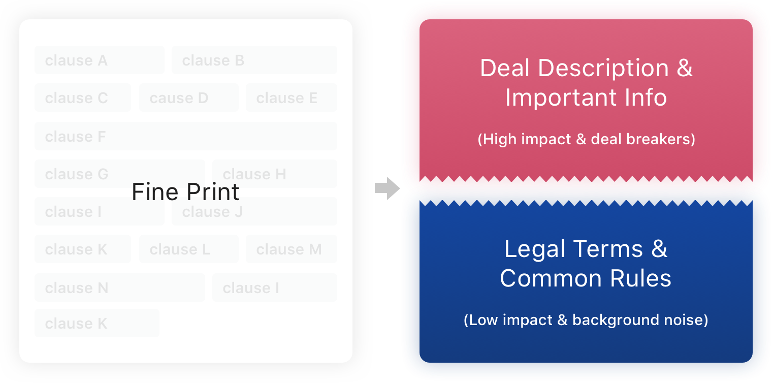
From the user study, I learned that not all clauses were considered as “fine print”. Users saw some of them as deal details and important information. The literal “fine print” in user’s mind is the background noise; it is general rules they expected to see on every voucher, such as purchase limitations or usage per visit. Hence, mixing these two types of info into a same Fine Print section was misleading. More importantly, it made the deal feels more restrictive. Therefore, I came up with the idea of pulling out those “non-Fine Print” clauses from the Fine Print section and find a better way to display them.
Design
After understanding the user’s perspective and deciding the direction, it was time to dive in the design solution. I went through the following 3 steps:
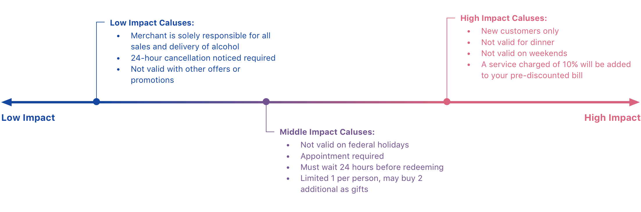
1. Define Fine Print clauses
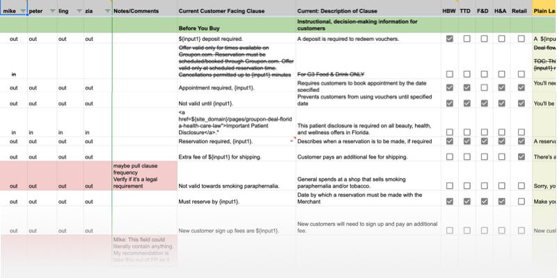
In order to decide what contents should be pulled out of Fine Print, I started sorting current Fine Print clauses. From user’s perspective, the “Fine Print” should be less impact on their purchase decision. It is considered a place to show general rules or legal terms, but shouldn’t include big deal breakers. With this definition, content strategist and I broke 150+ clauses to Fine Print and non-Fine Print(important info) two groups. Thereafter, we brought non-Fine Print clauses to the next step.
2. Create new groups for non-fine print clauses
The goal was to call out important information with less feeling of being restricted. Since the content of the clause couldn’t be changed at that moment, we focused on finding the right grouping and proper name for each group. Also, the data shows there’s a correlation between the number of the groups and conversion. Therefore, we also chose to reduce the number of groups. After a lot of back and forth discussions, we landed on these four groups.
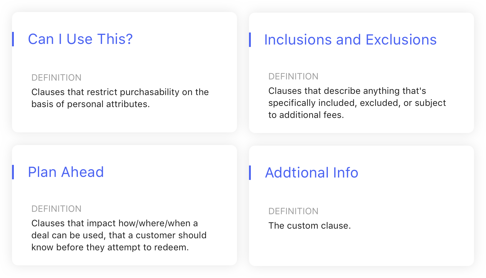
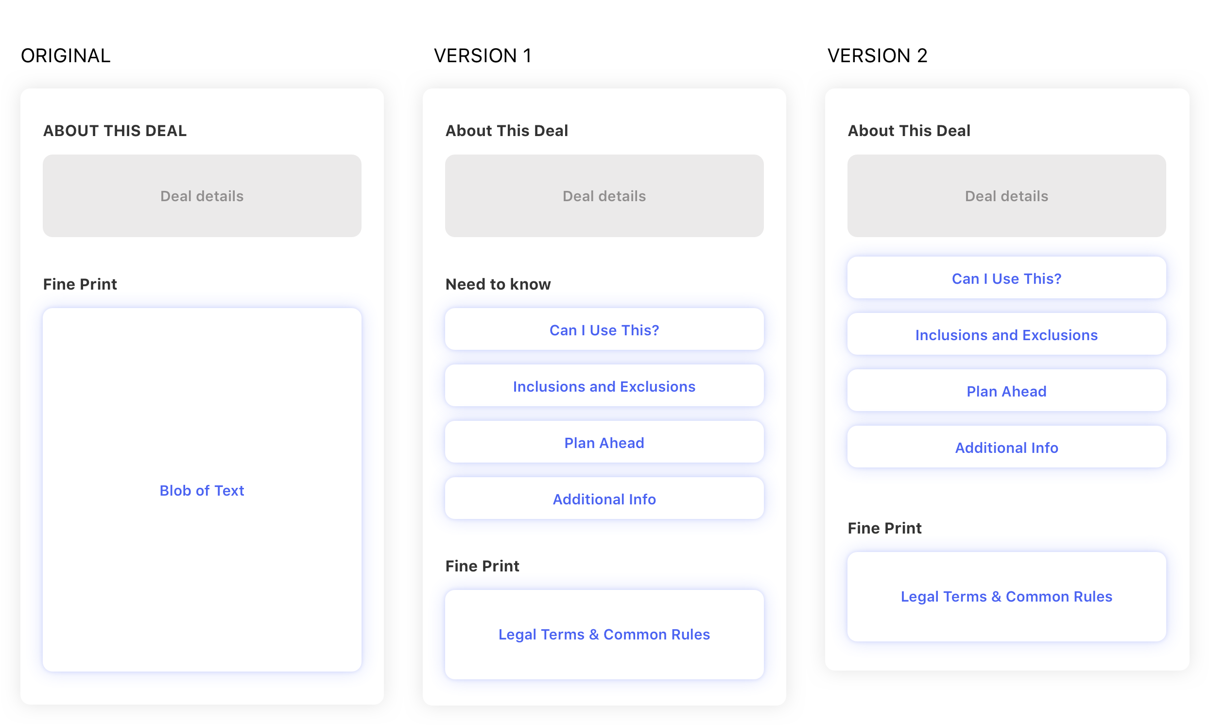
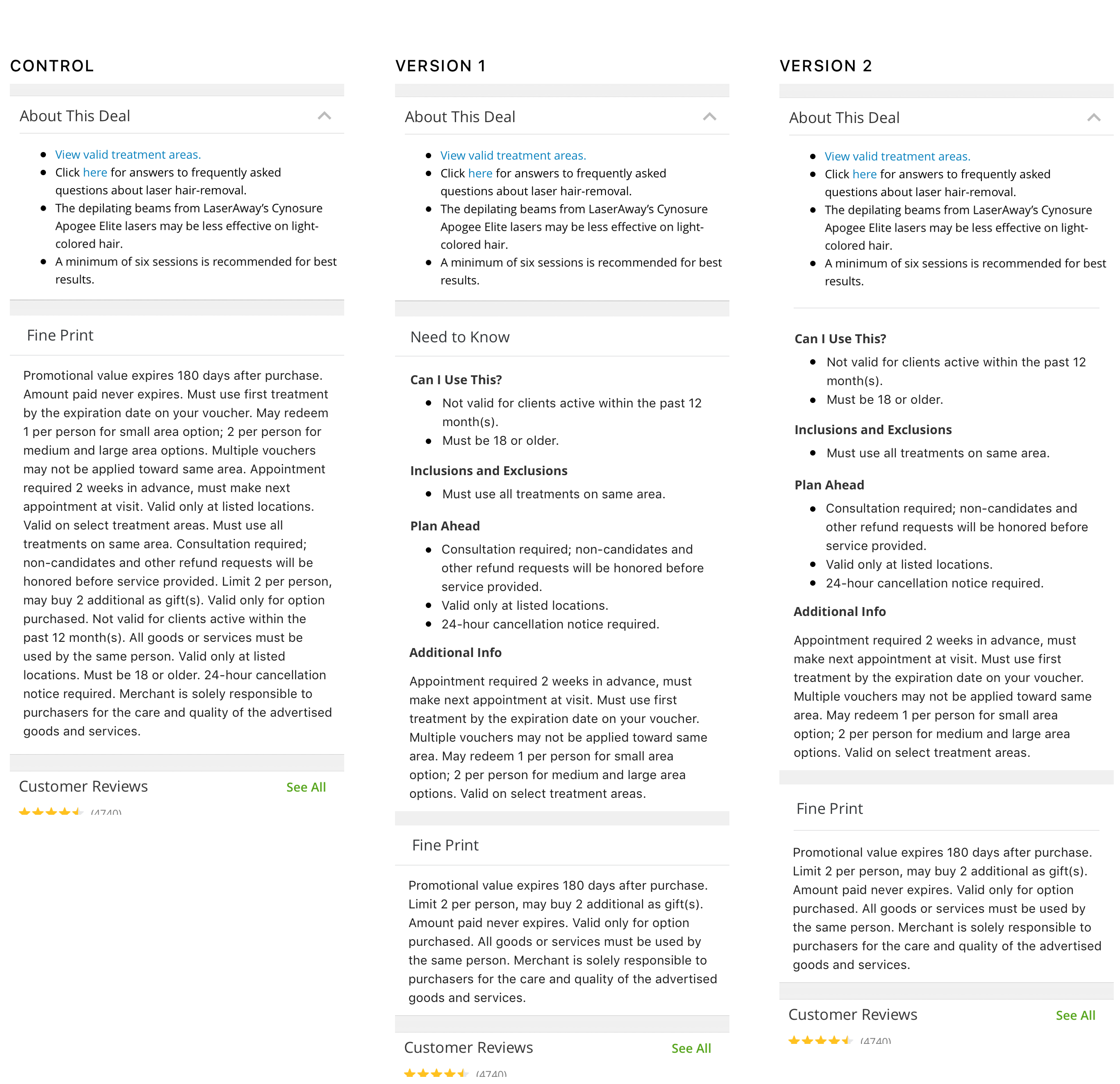
3. Propose two versions
At this point, all components was ready. Next, I need to find out what’s the better structure. I came up with two versions. One was to create a new section called “Need to know”, which had a softer tone, to display non-fine print clause groups. The second option is to merge non-fine print clauses with “About this deal” section, which treated those clauses as part of deal description. In both treatments, I made the remaining fine print clauses as blob of text to reduce its prominence.
User Testing: Proof the Concept
Goal
In order to pick one version to run A/B experiments, we conducted a quick remote user test to find the answer. At the same time, we also wanted to learn whether the new design makes users feel the deal is less restrictive.
Tool & Task
We used usertesting.com to remotely test 32 people. They was asked to compare either version 1 with control or version 2 with control, and rate the restrictive level of each version.
Takeways
- Both version 1 and version 2 helps increase the visibility of high impact content.
- Making high impact content more visible to users helps build trust and increases their confidence in making purchase decisions.
- Having shorter Fine Print section makes users feel like a deal is less restrictive (even though we just moved the content to other sections).
- Comparing both version1&2 with control, users are more likely to be made aware of certain requirements of deals, which could negatively impact conversion.
- Some users felt having a separate “need to know” section apart from “about this deal” is redundant.