Price is one of the most critical elements on a deal page, but we didn’t have a standardized pricing framework. Each inventories can have different pricing frameworks, which makes the price system hard to maintain and scale to new features. In this project, I took a lead role in building a consistent pricing system.
- 1 Designer (Me)
- 1 PM
- Cross-platform Engineers
- Design System
- Visual Design
Step1: Collect All Cases
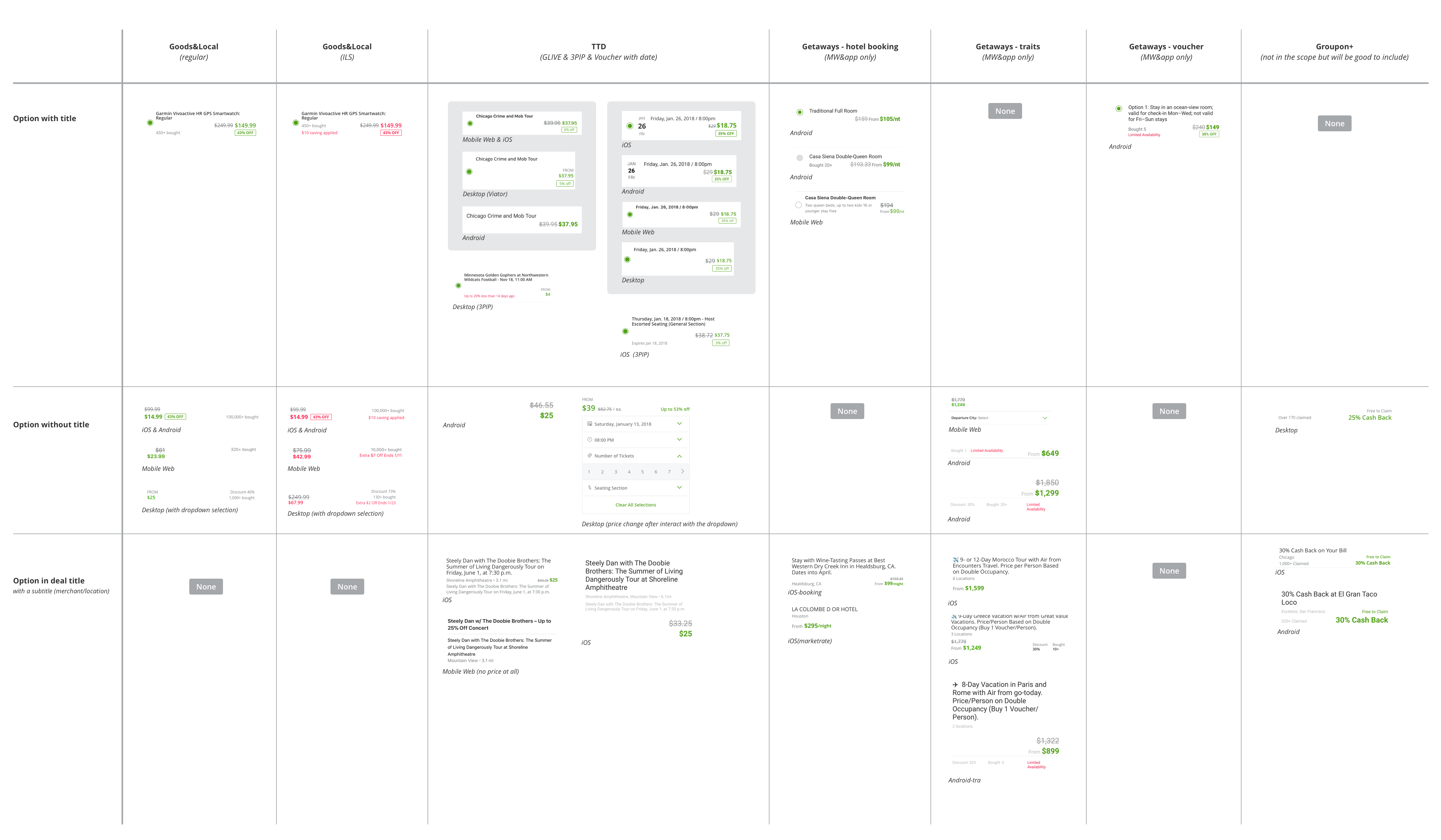
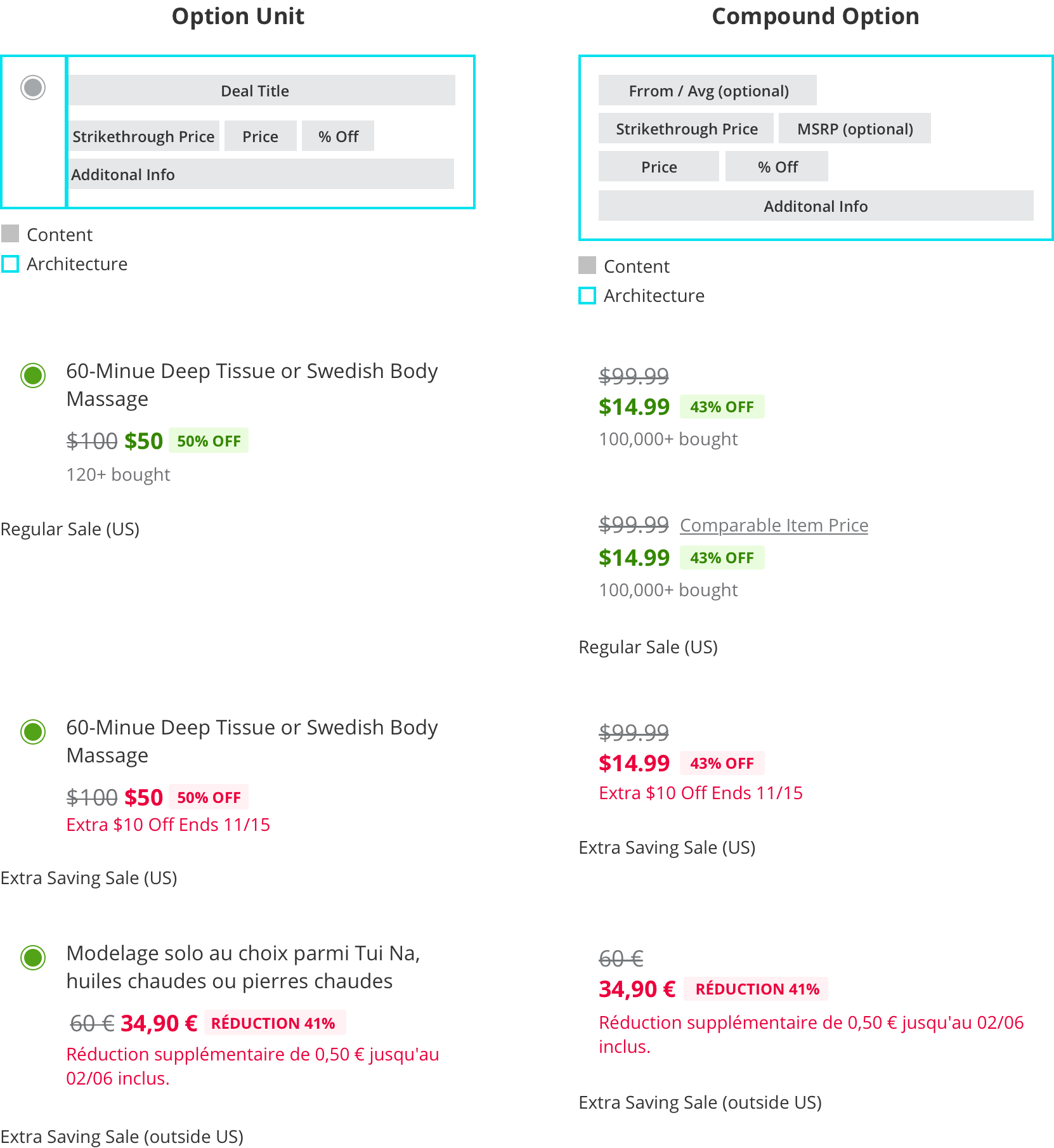
Price is part of the deal option and it won’t live alone, so I defined the price system under the options framework. In this step, I collected option layouts from 3 channels (Local, Goods, Getaways) and 4 platforms (iOS, Android, mobile web, desktop) as the image below.
Step2: Analysis
After collecting existed option layouts, I categorized them into two types:
- Option Unit - can have multiple price units
- Compound option - single price
As you can see, each option type had subtle differences between platforms. The goal was to make them consistent, so here are 5 components should have in every option:
- Option title
- Strikethrough price (MSRP price)
- Discounted price
- Discount percentage badge
- Additional info (usually is the social proof message)
Step3: Create Patterns
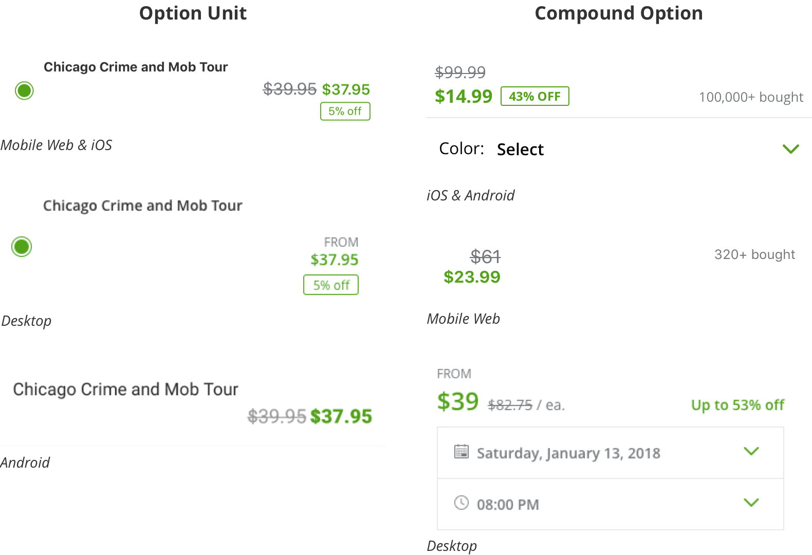
Version 1: Extend existing Layout
In this version, I defined the standard layout by reusing one of the current layout. Also, I moved the radio button to the left top corner to make sure the selection is always clear to the user.
Pros:- Fast to build: reusing existed layout so it will take a shorter time to build
- Scalability issue for long text: the layout can break out easily when translating the additional info to languages such as Italian and German.
- The extra saving message is disconnected: Different alignment makes extra saving price and its message looks unrelated even though they are using the same color..
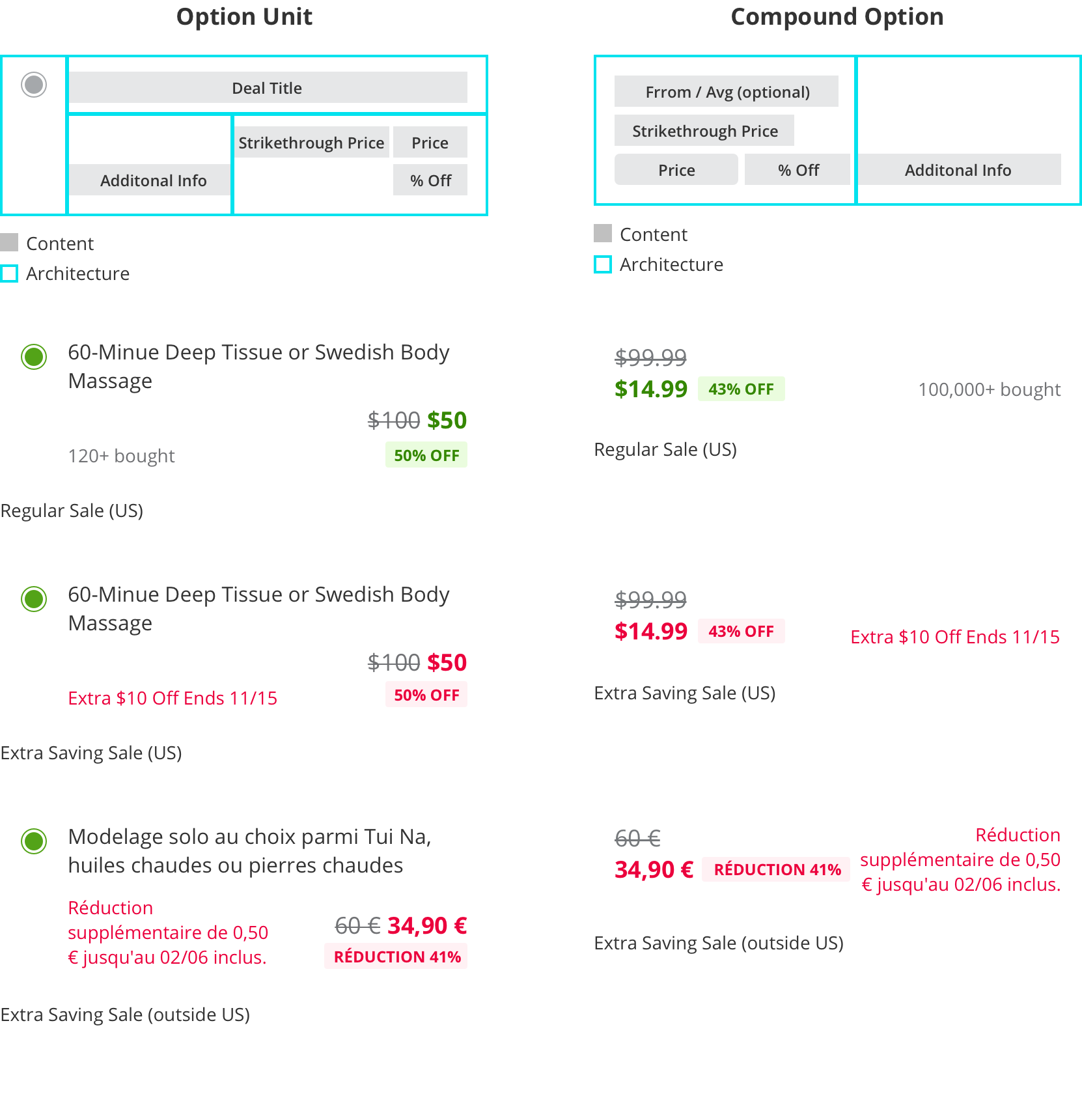
Version 2: Scalible Layout
To solve the long text and the extra saving message’s disconnection issues, I proposed this new alignment to refine the system.
Improvments:
- Smoother eyes flow: the eyes don’t need to jump between right and left side. It has better readability.
- Scale to different length of text: the flexible full-width layout can fit long text without breaking the layout.
- Better grouping: the extra saving price and message are closer. It helps the user to understand the meaning better.
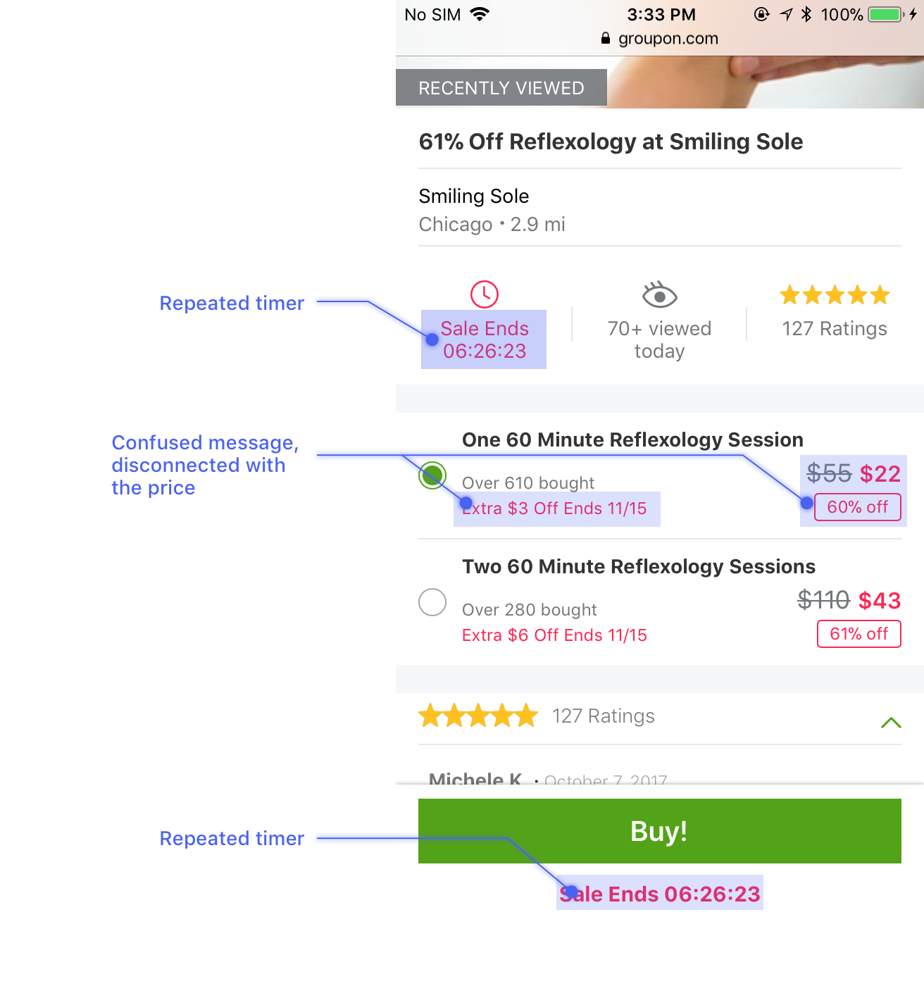
Step4: Extra Savings Content Improvement
When the first time I saw extra saving deals, I was confused. I didn’t know what did “Extra $10 Off Ends 11/15” means. Have I received the savings or not yet? Later on, I found I was not alone from the user interview sections.
Problems:
- Confused message: user get confused whether extra savings applied on the red price or not
- Disconnection: it’s hard to connect the extra saving sale message with the price (this has been addressed in Step 3)
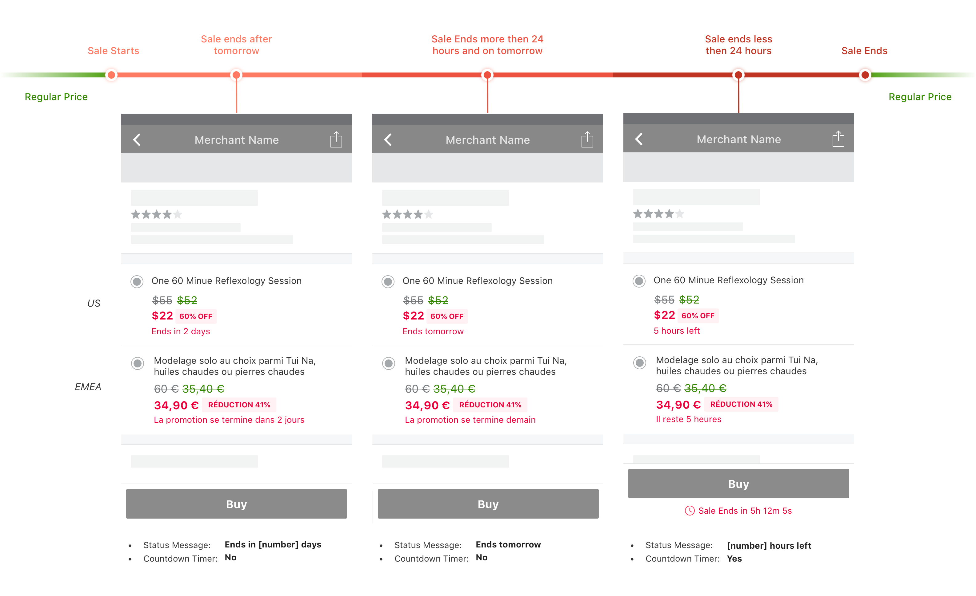
- End date is less impactable: the sale ends date is less urgent and unclear to users about when is the exact ended time
- Repeated messages: the extra saving message is called out in three different places on the same screen
Create three time periods